I’ve always loved wearing bright colours, you know the kind that change your mood the minute you wiggle yourself into that apple red dress! Most of my summer wardrobe is brimming with lemon yellows, girly pinks and cobalt blues.
My love for colour has been my companion throughout my design career, serving me well when I had my own freelance graphic design business.
I was never afraid to use colour in my design work and my clients really appreciated my palette choices which seemed to come so easy to me at the time. Which is why I found myself in both a bizarre and frustrating situation when I became a full time illustrator.
For some reason, my biggest challenge was colour!
Especially when it came to using bright or bold colours in my artwork. Every palette I tried looked hideous so I would generally opt for a more muted palette with softer tones which at the time, seemed like a far safer option.
Thankfully since the early days I’ve learned to stretch my colour muscle again and now find it easy and exciting to use bolder and brighter colours in my work. I’ve developed a signature colour palette for myself that is my go-to each time I start an illustration.
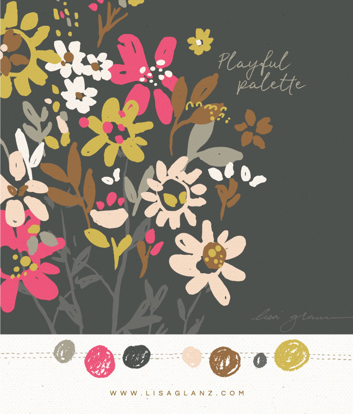
If you’re struggling to introduce bold colours into your creative work, start with one pop of colour. The easiest way to do that would be to pick a muted palette, then include one or two bold colours, similar to this Playful Palette I created.
Have a look-see at the other Playful Palettes I’ve created that might help you if you’re struggling to add some splash of colour to your work.
Drag the colour chart below onto your desktop for future reference. Enjoy!





0 Comments