
As a creative, I spend a lot of time looking for colour inspiration and palette ideas. I think it’s fair to say that you don’t have to be a designer to know the importance of colour choice in the success of a design.
Since illustrating full time, I’ve become even more acutely aware of how colour can make or break a piece of artwork. In fact, research shows that colour influences our choices and perceptions when it comes to brands, products and our senses, among many others.
Colour inspiration
These are my go-to resources I use for colour inspiration.
- My pinterest board
- Color Collective
- Love print studio
- Design seeds
- Color Palettes
- Nature! I often use nature as reference when it comes to particular hues and shades of colours that go well together. Next time you’re walking in your garden notice how that particular hue of green on a leaf is just the right shade for it’s purple flower. It’s amazing stuff!
- Your own work. I know that sounds weird, but sometimes when I’m stuck I look back at my previous work and often come across a colour combo I’ve forgotten about that I loved. If it worked back then, it might be perfect for the piece you’re working on now.
Top tip!
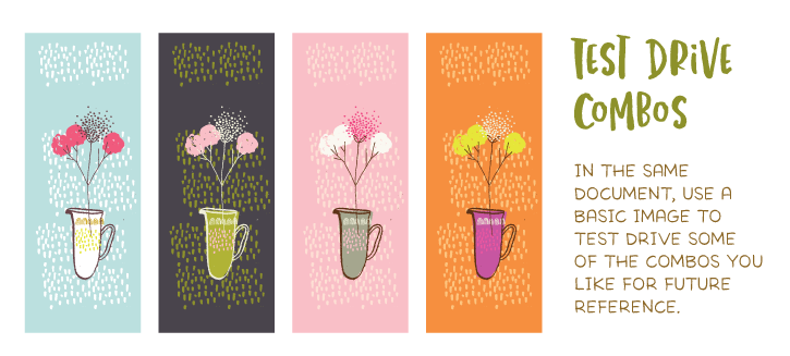
I created an Adobe Illustrator file a few years back and started adding swatches and colour combos I really love. I now use it as a starting point to all my illustrations. For variations I simply tweak or add one or two new colours as I go.
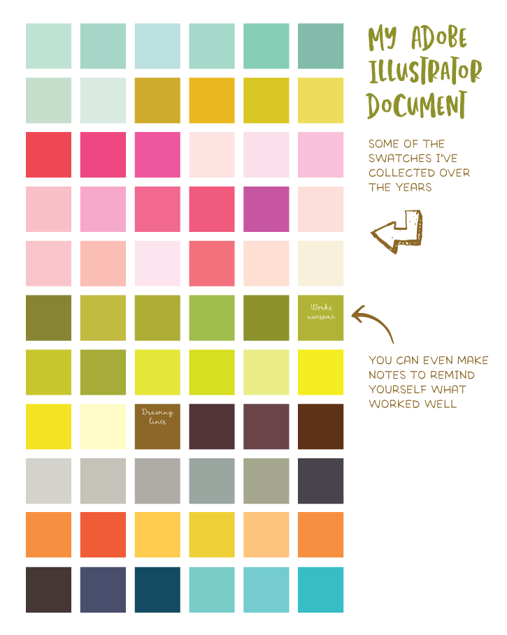
![]()
Reference and tools
These are all great tools and references for creating palettes or finding the breakdown/code of the colour you’re after.
I hope you found this list useful! I highly recommend starting your own go-to colour reference document, it’s a huge time saver.


Thank you Lisa, I love the idea of an illustrator file for reference! I’m going to try it.
Yay! Definitely give it a go, I think you’ll find it very handy 🙂
This is really great information! You definitely have a certain color palette that is recognizable and I think that really helps your work stand out! I would say overall your color choices are usually softer with some gray in them. Thanks for sharing your process!
Thank you so much Bethany. So happy to hear you found this useful 🙂 Finding a signature colour can make your illustration experience less stressful, it’s helped me focus on the drawing rather than hours of fretting over colour!
Definitely making a swatch file in illustrator. Love that!
Excellent! It’ll save you loads of time 🙂
Thanks Lisa! The swatch file is such a good idea. Thanks for sharing 🙂
It’s a great pleasure! Glad you found it useful 🙂
Hi Lisa! Intetesting thing about your color swatch Illustrator document. I never thought of that. I usually save my favorite color combinations as an .ase swatch file. But the hard thing about that is that 1) you have to remember what you named it, and 2) you have to open it to see the thumbnail colors. I definitely like your idea better because your favorite/most successful colors are all in one place easy to see! Thank you! ❤️
Hi Kim, I use to do the exact same thing! And got more and more frustrated in trying to find the exact palette I wanted. Hence the Adobe Illustrator file was born 🙂 Now it sits at the top of all my files on my hard drive, plus it’s an asset in my Adobe library so I’ll never have to hunt for it again 🙂
Hi Lisa, I just watched your Skillshare class and loved it, thank you! That linked me to this story, thanks so much! Colour is the thing I have the most trouble deciding on when I’m creating and this is a HUGE help. I really appreciate your generous sharing.
Hi Rosalie,
So thrilled to hear this is helpful to you! Thank you for taking the class, glad you enjoyed it. Colour can be a tricky component to master. Once I started creating my swatch document life got a lot easier when choosing colour, so I hope that it will be helpful to you too 🙂
Hi Lisa!
Would be really great to learn how to make a document like this! I’m currently taking your skillshare class and would love a class or tutorial on making this document as I can see it being a valued resource for all kinds of projects!
Thanks so much!
Bethany xx
Hi Bethany! Thank you so much for taking my class! That’s a great idea for a class, I’ll definitely add it to my list 🙂 It really is a great document to have and some I use in my own work everyday.